Sunday 27 April 2014

Carriage UV Mapping and Texturing

Now that the house is more or less finished, I felt that the carriage was the next most urgent model to be textured. 


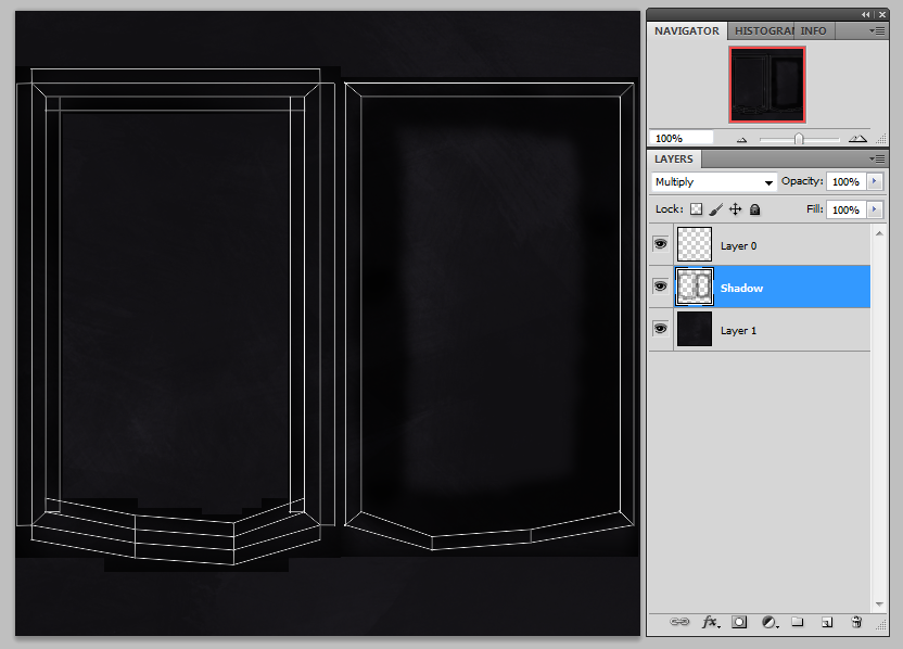
Like with the bricks that form the walls of the house, I've created a high poly version of the padding that spreads on the interior walls of the carriage to use to create the textures for the low poly model. I created a diamond pattern with 'buttons' to achieve a look inspired by the Brougham carriage that I photographed in the Lincolnshire Life Museum. I took an ambient occlusion pass to use as the basis for the interior texture, using it as a 'Multiply' layer on top of the base colour layer. After adding a little dirt and shadow, it's ready to apply to the model.   


For the door and windows, I used the alpha channels to give transparency to the faces made from glass. I gave them a little mist and dirt around the frames to look more natural, as the windows on a horse-drawn carriage would no doubt become quite grubby during the journey.  


I've also constructed a lantern to hang on the side of the carriage, which was previously missing from the model. 


Saturday 26 April 2014

More Manor House Texturing

I've just been pushing on with texturing this manor house. Once I was happy with the brick texture, I was able to get on with the rest of it as many of the other features of the building use the same base colour as the bricks - so that was the first thing I needed to get right. 

The way I build up each texture in Photoshop has become something of a routine as well - I begin with a base colour layer which establishes the basic tone of the material. Then I give it texture by using various brushes and sometimes my own photos of real-life materials. The next step is adding a fixed shadow to the areas which would naturally be darker, or areas which I want to always be dark even when affected by lighting. I always set this layer to 'Multiply' so that the texture below it is still visible but also affected by the shadow. On top of that I add a 'grime' or 'dirt' layer, which consists of various brown and green patches created with different brushes to give the affect of natural dirtiness - particularly at the bottom of objects and areas where two parts intersect that would naturally gather grime and dirt from exposure to the elements. This is the process I have been using for the majority of my texture creations.   


Secret Door Passage Texturing part 2


Sunday 20 April 2014

Thursday 17 April 2014

Monday 14 April 2014

Terrain Texturing

Effective terrain textures are important in a game level. The difficulty is creating a texture with as little visible seams as possible. In Unity you can manually 'paint' the ground surface with multiple textures and blend them over one another to create a natural looking ground. Before I could paint it, I wanted to create all of the terrain textures I'd be using from scratch. 

For the grass texture, I started by painting a soil base which I could have visible in some areas of the grass.  


On top of that I painted a grass base colour layer, and added highlights for both the mud and grass layers. Then there is a photo texture layer, where I have an image I've taken and set it to multiply so that it is slightly visible but doesn't cover the details I'd already painted. I found this gave a better result than trying to paint grass blades which looked too cartoon-like. Then I added another colour layer on top so that the photo texture blended better with the other painted layers. I erased sections of the painted layers so that parts of soil are visible beneath the grass. I've repeated this process in another file so that I have some variations of grass textures to blend into one another - this stops the ground texture looking too repetitive. 


Below you can see the terrain options in Unity. This is how you apply textures to the terrain surface, as well as altering the terrain itself and adding foliage to the scene. There are a variety of brushes that you can use to paint the terrain with, so I have used a combination of these brushes set to differing levels of opacity. From a distance the textures do look very repetitive, however once you are viewing it from the player's perspective the appearance is much better.  


I've also created a gravel texture which I will use to create paths.