Wednesday 27 November 2013

Aspects of the Animatic

I created a digital painting for each scene shown in the animatic. I wanted to create a fairly close representation of the visuals I hope to achieve. Below are all of the scenes I have illustrated. 
_______________________________________________________

INTRODUCTION


 __________________________________________________________

WINNING SEQUENCE


_____________________________________________

FAIL SEQUENCE


Monday 25 November 2013

Stone Wall Model


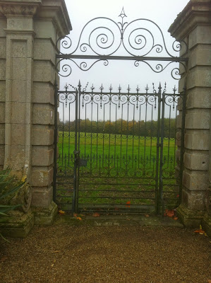
Using this photo I took from my visit to Thorpe Hall as loose inspiration, I've made a prototype model of a basic stone wall that could be used in several areas of the game level. 


Saturday 23 November 2013

Cutscenes Animatic

The cutscenes from the level in the form of an animatic.

Tuesday 19 November 2013

Modelling Practise

I've started making some preparation models to practise my skills and to specifically work on how to create models for a game. For this model, I've used a reference image to see if I can replicate an existing piece of architecture.

Image by Clara


I made the end of the wall look as though it has partially collapsed, I think with the right texturing it could look very well worn and aged. The right approach to video games modelling, is to create simple meshes and use the detail in the textures and normal maps effectively. 


Sunday 17 November 2013

One More Field Trip

Today I took the opportunity to visit Thorpe Hall in Peterborough, given that it's so close to home for me. It couldn't be a more perfect location to get some visual inspiration for my project. Below is some information about the building.  


I took about 200 pictures of the building, its surroundings and some of the architectural features. When it comes to modelling the more decorative details and designing the textures and foliage, I will be taking a lot of guidance from what I have seen today. 


Friday 8 November 2013

Storyboarding the Cut Scenes

Here I have storyboarded the opening scene. The playable sections occur after the 6th and 9th thumbnails. 


Thursday 7 November 2013

Experimenting with Different Visual Styles

I feel like I haven't really explored enough different looks for my environment. The pieces I have produced up to now have all been very similar in colour and artistic style. In order to create a level with an effective and eye-catching design, I know it is important to push my ideas further and to try a variety of styles to whittle it down to the best one.


This was another concept that I drew on the 8th of October. It captures the look that I have been sticking quite closely to in all of my concepts so far. I feel like the murky green is over-used in the scene, and that the sky in the background is too bright. Overall it does not feel very scary, and it is dark but calm. 


On the 2nd November I drew this view of the entrance gate. I wanted to give the whole scene a faint turquoise wash which I think feels sort of mysterious and a bit other-worldly. Then I added the gloomy greys and dull browns of the ground and stones to bring in the earthy element of a countryside setting, whilst maintaining a cold, unforgiving element. To make the scene more interesting, I've tried adding green, red and orange in the form of the foliage. I think this really brings it out, and adding into other areas of the level should give the level as a whole, a decent aesthetic. 


Something I realised I hadn't tried before was really limiting the colour palette, and also moving away from the traditionally natural palette I have been using so far. In this drawing I did both of those things, and tried giving the whole scene an elegant blue, inky wash. The effect of this is quite dream-like, perhaps it is too 'pretty' for a horror genre game level. However I think it would be very interesting to create a game level in this blue-painted porcelain appearance. 


Monday 4 November 2013

Discussing the Possibilities of Unity

I met up with Sean Oxspring this evening to discuss the mechanics of my game level, and anything that will need re-evaluating. Sean is a recent graduate of the university of Lincoln in Games Computing, and I've worked with him in the last year on a couple of small video games projects in the past year, including my 2nd year final project. In this year's project he will be assisting me with the programming aspect of the game level.

So what is achievable?

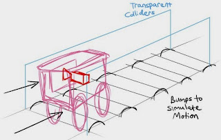
My introduction scene as it stands, is doable. In fact it will even work within the games engine as opposed to having a video file that plays, and then going into the game (this is what I originally thought I might have to do). What I would do is create some 'speed bump' objects in the scene on my road surface, and then create two transparent colliders to kept the carriage from going off course. The camera is placed inside the carriage, which gives the option to also allow the player to look around the carriage interior as well as out the window; or it can be fixed to only show the window view.

The next aspect of the programming is the random location generation for the key which must be found. Apparently this is quite simple to achieve. I will create 7 empty 'objects' in the level and place them in each of the locations I have planned. I can then create a condition that causes my key model object to appear in any one of these empty objects, each time the game starts. The engine will generate a number from 1 to 7 and this will determine the origin of the key object.    

Now for the bad news, there is an issue with my idea of having the hands on screen actually interacting with objects in the scene. Apparently this is quite difficult to achieve, or at least, I would require a much longer period of production as well as needing a small team of programmers to work out the interactions.

The alternative I am considering, which shouldn't demand as much programming work, is a mechanic like that in The Chinese Room/Frictional Games' "Amnesia: A Machine for Pigs". The UI consists only of a very small dot in the center of the screen that indicates your line of view. When the player's view lines up with an interactive object, a hand icon appears over it, letting you know that you can interact with this particular object. As you click and drag, the animation plays and in some cases will trigger another action.

GIF belongs to Nicko
I would consider having a similar system in my own project, where the player will have a line of site that will indicate to them which objects are interactive, and when they click the object's animation will play.  


ON THE FENCE - additional models for Thaxnay's film

For the last couple of weeks I have been working on two 3D models for Thaxnay's production "On the Fence". I was asked to model two vehicles to match his concept designs; the first is a pickup truck and the other an "old banger" car. Both designs are heavily stylised to appear quite cartoon-like, and I was told to stick closely to the concepts.