Thursday, 8 May 2014

Entrance Gates and Cherubs Textured

 For the gates, I've created a different material for each section (the gate, frame and crest) so that I could put shading in the right areas to give the effect of natural wearing. For the design of the padlock I looked back at my concept sketches as well as taking reference from real examples of Victorian locks.


Victorian locks I photographed when I visited the Museum of Nottingham Life in February. 


The texture for the stone columns was made in the same process as the materials for the manor house. I used a photo I've taken of stone bricks to add texture, as well as a mixture of brushes and blending colours. I then applied the same material to the magpie statues.


For the walls at either side of the gates, I used the same brick wall process as before - creating a high poly version, taking an ambient occlusion pass and using this to create a texture for the low poly version. The reason I created a new brick wall is because I wanted the bricks for the wall to be smaller and more uneven than the bricks used for the manor house. 


How the final texture appears. I also created a new material for the metal bars of the fence. 


Next I moved onto re-mapping and texturing the cherubs. The column model was made by Alex, but again had more mesh than is needed for this purpose so I reduced the amount of edge loops without changing the shape of the object too much from its original appearance. This was simple enough to UV map and texture. 


To start with I had Peter unwrap the UVs in ZBrush, however I found that they still had a lot of issues. So I manually unwrapped it again - from scratch - in Maya. It's not perfect but it was a lot better than the first version, and I made sure to place the seams in the least visible areas.  


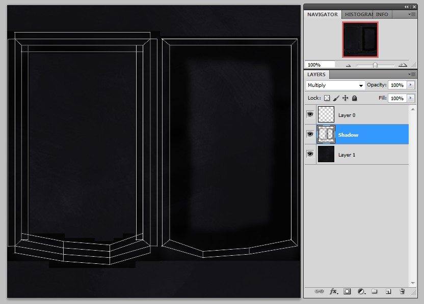
The same texture is used for all of the cherubs, each one is slightly different so I just had to move the UVs around until they looked right - with the shadows in the right places. 


The next step was to place some ivy vines around them. I imported the three types of vertical ivy vines which I created previously and then altered the vines and placement of the leaves to appear attached to the statues. Each statue has the ivy climbing in different ways, inspired by Estelle's concept art.   


Saturday, 3 May 2014

Carriage UV Mapping and Texturing Continued

Using the same processes as before, I'm continuing with texturing the carriage. 


I'm adding painted lines to some sections of the carriage, as I noticed these on the Brougham carriage that I looked at before. I thought this would be an extra detail that would improve the overall appearance and stay true to the history behind the object. 


The carriage complete with textures. 


Thursday, 1 May 2014

Background Art for Miho's Film

On the side of my own project, I have offered to help Miho in the production of her 2D animation by colouring the backgrounds. I was given the line work for each image below, and a piece of coloured concept art with the colour palette which the director wanted me to follow. I've coloured the images digitally using a software called "Fire Alpaca" which I find gives smoother brush strokes than Photoshop. This means I could produce the work fairly quickly, with a relatively simple process. 

Below are all the images which I have coloured. 


Sunday, 27 April 2014

Carriage UV Mapping and Texturing

Now that the house is more or less finished, I felt that the carriage was the next most urgent model to be textured. 


Like with the bricks that form the walls of the house, I've created a high poly version of the padding that spreads on the interior walls of the carriage to use to create the textures for the low poly model. I created a diamond pattern with 'buttons' to achieve a look inspired by the Brougham carriage that I photographed in the Lincolnshire Life Museum. I took an ambient occlusion pass to use as the basis for the interior texture, using it as a 'Multiply' layer on top of the base colour layer. After adding a little dirt and shadow, it's ready to apply to the model.   


For the door and windows, I used the alpha channels to give transparency to the faces made from glass. I gave them a little mist and dirt around the frames to look more natural, as the windows on a horse-drawn carriage would no doubt become quite grubby during the journey.  


I've also constructed a lantern to hang on the side of the carriage, which was previously missing from the model. 


Saturday, 26 April 2014

More Manor House Texturing

I've just been pushing on with texturing this manor house. Once I was happy with the brick texture, I was able to get on with the rest of it as many of the other features of the building use the same base colour as the bricks - so that was the first thing I needed to get right. 

The way I build up each texture in Photoshop has become something of a routine as well - I begin with a base colour layer which establishes the basic tone of the material. Then I give it texture by using various brushes and sometimes my own photos of real-life materials. The next step is adding a fixed shadow to the areas which would naturally be darker, or areas which I want to always be dark even when affected by lighting. I always set this layer to 'Multiply' so that the texture below it is still visible but also affected by the shadow. On top of that I add a 'grime' or 'dirt' layer, which consists of various brown and green patches created with different brushes to give the affect of natural dirtiness - particularly at the bottom of objects and areas where two parts intersect that would naturally gather grime and dirt from exposure to the elements. This is the process I have been using for the majority of my texture creations.