Thursday, 31 October 2013

Concept Development

I felt I needed to create some concept pieces that would reflect how to player will view the environment in the game level. Doing this also helps me to come to a decision on the final colour palettes, after taking inspiration from my visual research on films, video games and real life settings. 


On Tuesday I played with a new painting software called 'Mischief', keeping with the dull blues and greens of a cold countryside scene which I have used in my previous concepts. This time I tried adding a little red in the leaves of the trees for an autumnal feel. I think it works nicely with the scene as a whole, and it doesn't feel too out of place. I'm not sure if takes away from the 'scariness' of the environment, I will have to ask for some opinions from others on this. 

The house in this drawing is probably a little smaller than those in my previous concepts, I was experimenting with the idea of scaling down the grandness of the house. However I think a larger, more extravagant style works better to create an intimidating feel for the player. 


Today I drew up a mock-up of how I envisioned the opening cut scene, from the player's point of view. This is the angle from inside the carriage as the player is arriving at the manor house. The carriage interior consists of a lot of dark blue, purple and grey to reflect the Gothic style, inspired by my visual research into the Gothic horror genre. In the windows (which I've made to look a little fogged up and slightly dirty) you can see some of the outside scenery. I've used the dark green, blue and reds similar to those in my previous concept piece. 

After some feedback from Hilary, we agreed that maybe a more effective angle for the camera would be to face out to one of the side windows, as though the character is looking out at the scenery. So in my next drawings (including storyboarding the cut scenes) I will try out this alternative viewpoint. 


Friday, 25 October 2013

Field Trip Visual Research

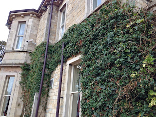
Today I visited the building which was formerly St. John's Hospital in Bracebridge Heath, on the outskirts of Lincoln. The hospital was built in 1852 and was first used as a "lunatic asylum", but during its history has also been used as a regular hospital until its closure in 1990. The building's location and history are ideal for my reserach, even if the architectural style is a little different from what I'm doing. Plus, the building is said to be one of the most haunted in Lincolnshire, which intrigued me even more.  


I took many pictures of the building and its grounds to inspire me, these are just a few of them. I will be referring to the forms in the architecture as well as elements like the foliage as I'm refining the design for my manor house scene. 


Thursday, 24 October 2013

Final Story and Script

MANOR - Playthrough Sequence and Cut Scenes

CHARACTERS
Grace - The main character, you play from her perspective. She is late-teens/early twenties, English, upper-class.
Rosa - The twin sister. She does not appear in the game, but she is part of the story. She moved away from the family home when she married, and went to live at the MANOR.

BACKSTORY
Grace knows something isn't right, as Rosa hasn't been in contact since she moved away. Being a "no-nonsense" type of person, she has gone to investigate. She had a very close bond with Rosa as they grew up, which is why she is so concerned with finding out what has happened to her sister.  

OPENING CUT SCENE
Fades from black. First person view from the main character's POV, she is sat inside the carriage. Camera shakes up and down slightly to show the motion of the carriage. Scenery can be seen passing by through the windows. SFX - Horse trotting, birds, wind, carriage rumbling.

DIALOGUE
Grace - "This isn't right at all. I must find out why my dear sister has been so silent since she moved away. I've had nothing, not a single letter. I know Rosa too well, she would have written to me by now. All I have is this address.  (PAUSE) Oh, it looks as though we've arrived. (SHORT PAUSE) Excuse me, Driver? (PAUSE) Driver?

Partway through dialogue SFX of gates swinging open.

Camera jolts (to emulate a crash) and the screen fades to black again. SFX - horse whinnies (frightened), carriage creaks/thuds, mud/earth splatter, wood splitting (carriage breaking), Grace gasps

PLAYABLE SECTION
Fade from black. Sarting view from Grace's perspective as she is looking at the broken carriage. It is mainly in tact, but the section which was attached to the horse is snapped and the horse is gone, as is the driver. The carriage door is open on Grace's side. SFX - ambient outdoor sound, wind, birds, leaves rattling

DIALOGUE
Grace - " W-what happened? The horse...and the driver!"

TEXT INSTRUCTIONS
"There is no way back, you will have to move forward. Go to the house."

There is an obvious pathway on the ground where the player is placed, once they turn around they will also be able to see the MANOR clearly. They move Grace forwards up the pathway until they reach the front door.
_____________________________________________________________________________________________________
TRIGGER: STANDING AT THE FRONT DOOR
TEXT INSTRUCTIONS
"X - Ring the doorbell"
PRESS X - Grace's hands pull a doorbell (SFX doorbell ring)

DIALOGUE
Grace - "No answer. (PAUSE) Then there is no-one here?"

TEXT INSTRUCTIONS
"You will have to enter the MANOR on your own. Search the grounds for the groundskeeper's key. Don't linger, it will soon be nightfall. You wouldn't want to be here when darkness arrives."
_____________________________________________________________________________________________________
PLAYER EXPLORATION

What follows is a list of the OBJECTS/AREAS that will TRIGGER events.
_____________________________________________________________________________________________________
 
CARRIAGE
press X - open/close the carriage door (SFX - door creak)

FRONT GATES
press X - hands rattle the bars (SFX - bars clanging)

TOOLS & WOODBLOCKS - GROUNDSKEEPER'S HUT
no button necessary, they can be knocked over by walking into them (SFX - crashing wooden tools)

*KEY LOCATION* FLOWER POT ON DOORSTEP OF GROUNDSKEEPER'S HUT
press X - look inside the pot, see the key TRIGGERS WIN CUT SCENE

SECRET DOOR (AT THE MANOR)
press X - hand pulls the handle, it won't open (SFX - door slamming, Grace grunts)

*KEY LOCATION* SECRET DOOR (AT THE BASE OF THE DOOR)
press X - picks up the key in hand

FRONT DOOR
press X - ring the doorbell, no answer (SFX - doorbell ring)

DRIED UP FOUNTAIN (THE GARDENS)
press X - throw a coin in (SFX - metal plink, tapping onto stone)

*KEY LOCATION* DRIED UP BIRD BATH (THE GARDENS)
press X - pick up the key TRIGGERS WIN SEQUENCE (SFX metal key plinking off stone)

*KEY LOCATION* DEAD FLOWER BED (THE GARDENS)
press X - pick up the key TRIGGERS WIN SEQUENCE (SFX moving dirt)

*KEY LOCATION* TREE NOOK
press X - pull the key out from a hole in the trunk TRIGGERS WIN SEQUENCE

*KEY LOCATION* STATUE (NEAR MANOR ENTRANCE)
press X - take the key from the statue's hand TRIGGERS WIN SEQUENCE

*KEY LOCATION* GRAVE BED
press X - pick the key up off the ground TRIGGERS WIN SEQUENCE (SFX moving dirt)
___________________________________________________________________________________________________

WIN SEQUENCE (once the key is found)

DIALOGUE
Grace - "I've found it!"

TEXT INSTRUCTIONS
"Go back to the MANOR entrance. Quickly!"

The player still must reach the front door before the time is up in order to WIN.

TRIGGER: Standing at the front door WITH the key.
....................THIS IS A GAP THAT NEEDS SORTING OUT.................
____________________________________________________________________________________________________

FAIL SEQUENCE - TRIGGERED ONLY BY THE TIME RUNNING OUT
SFX - chime of a large bell, magpies cawwing , a descending drone

Tuesday, 22 October 2013

Character Design and Story

In order to develop the story behind my game level further, I decided that I wanted to create a loose character design for the playable character in the game. I felt this would help me to immerse myself in the story more thus being able to create a more believable and interesting 'world' for anyone that plays it. 


I decided that I wanted to stick with the idea of having a female character, the contrast between the level's ghastly appearance and the soft, feminine, lacey cuffs on the character's hands really appealed to me. In keeping with the story's Victorian time setting, I did a little bit of visual research on Victorian women's clothing for inspiration, the website this image is taken from was very helpful.  


I also used the book "The Art of Bioshock Infinite" to see some of the process of how video games concept artists create a character design. The characters of Bioshock Infinite have an influence of Victorian fashion styles and 1920s American dress that results in many interesting shapes and layers on the female designs. 
  
Art from The Art of Bioshock Infinite found at http://bioshock.wikia.com/wiki/BioShock_Wiki

So taking inspiration from "real life" photographs as well as video game concept artwork, I tried a couple of sketches of my main character.


She has the elegant style I was aiming for, but so far in these sketches I think she lacks a definite personality. I think what I was more concerned with when drawing these was the different sort of shapes and clothing items she might wear. I then decided to go and re-write my story plan, filling the gaps of the plot and also detailing the characters. After I solidified her character (and gave her a name) Grace started to take a better form in my drawing. 


I produced this more detailed and coloured version of a design, I feel that I have a better grip on my own story. She is not necessarily a final design, but I think that as she will never actually be seen during gameplay, it is not a major priority of mine to keep on redesigning her. The purpose of this artwork is really for myself and Alex to get a better feel for the project's story.   


Saturday, 19 October 2013

Video Game Level Inspiration

In regards to the visual style I'm planning for my game level, the aesthetic of "Dear Esther" has stuck in my mind as a visual standard that I'd like to work towards. I bought and played the game last year, and the visual style left an impact. It has quite a realistic look, the textures appear very detailed. The whole scene is made to feel more lifelike, I feel, because of how each scene is packed with foliage and rock formations. I want to try to replicate this natural type of scene in my level. 


I took these screenshots myself during gameplay of "Dear Esther". I will keep looking to them throughout production so that I stay on the right track, in the hope that I will achieve a similar standard of aesthetic. 


There are some good examples of aged and ruined buildings in "Dear Esther". 

Tuesday, 15 October 2013

Manor Sketches

I've been working on some sketches of the front side of manor houses to whittle down the particular shapes and features that I would want to include in the final design of my manor. Using a combination of reference images and working from my imagination, I've produced a few different versions of manor houses. 


I quite like the recurring triangle forms in this one, I think the peaks feel quite intimidating. It reminds me a lot of the place that I took my horse riding lessons growing up - Lynch Farm, Orton, Peterborough. I think I will aim for the final design to have this 'large house' feel as opposed to a bigger scale castle/palace building.

Lynch Farm, Orton A popular riding centre with access to many paths and bridleways around
Ferry Meadows.
Photo belongs to Michael Trolove http://www.geolocation.ws


This sketch was a rough copy of an image I found that had inspired me. However I think it doesn't quite fit in with the English setting of my story. The spires are perhaps a bit too magical looking. But I do like the look of the overgrown grass and the plants that have begun to grow in the bricks. 

Benjamin Wiessner
Photo belongs to Benjamin Weissner http://www.flickr.com/photos/benjaminwiessner/


This sketch was about getting a few ideas for features down. I think it's a bit too messy and feels like too much is compacted into the area. 


This is an attempt to play with architectural features that I had seen in my reference images, and to try out combinations of these features in my own design. I think it feels a little too grand and palatial. The clock tower and the spires are reminding me of a Disney princess' palace. I would like to stick with something more like the section on the far left, not quite as fantastical.  


This is more in the right direction. I like the squareness of each section of the buildings, with triangles at the top. I think keeping all the forms in the architecture angular rather than rounded will make the building colder and perhaps more intimidating. It will still be grand, but more overpowering than soft and elegant. 


Monday, 14 October 2013

Visual Inspiration - Films

To help spark a few more ideas in terms of the visual style of my project, I wanted to look at the Gothic Horror/Period Horror genres. There are two main examples that I feel have some similar features that I wanted to explore in my own project; "Dorian Gray" (2009) and "The Woman in Black" (2012).

"Dorian Gray" is set in the late 19th century, therefore is a good aesthetic reference for the time period that I would like to reflect in the design of my game level. Looking at it in terms of cinematic visuals though, I think the film has some very nice colour palettes and generally dreary lighting that compliments the dark tones of the story. I took screen captures of a few of the shots that I thought had colours, angles, features and lighting that would benefit me when it comes to creating more concept artwork.  


"The Woman in Black" 2012 film adaptation of Susan Hill's novel, displays traditional Gothic horror aesthetics. The grand setting of Eel Marsh House gives off an unsettling air with a dreary colour palette and the use of thick, untamed foliage visible in most of the outdoor scenes. I also want to evoke the same type of emotional response from anyone that will be playing my game level. 


Estelle's Concepts

After giving my presentation to the class, Estelle showed interest in producing some additional concept art for my project. Since then we have talked through my ideas and she has been producing some very helpful pieces to do with both the manor house and the look of the character's hands. She has also helped me in developing the story, which I will be rewriting shortly.

Estelle's work for my project can be found here: http://estellesharpedevelopment.blogspot.co.uk/ 

Saturday, 12 October 2013

Concept Progression

Using the photo references I have collected so far, I have created a few colour palettes to work with for now. I am thinking I would prefer to keep the tone of the scene very natural and earthy, but also cold and wintry. The greens and browns against a grey sky feel very 'English countryside' to me, so that is what I'd like to keep in mind. 

I'm against the idea of making this game level a typically 'spooky' or horror genre aesthetic. I think when I describe the idea to people as a Gothic horror game, it conjures up images of purples and blacks with gnarled trees and things that jump out at you. That's not at all my intention for the scene, what I really want is subtle terror. Less of an obvious scariness and more of a feeling of unease in an environment that feels very unforgiving.  


So with these colour palettes I've had a go at creating a couple more concept paintings. The first one is very basic blocks of colour. I just did it this way because I wanted to see if the colours were working. 


The second piece is similar, in that I was testing more colour styles. I think they both give a very similar feel. The first one is quite rich, whereas the second is more washed-out. The first piece seems to fit more with the time of day I had in mind (it is supposed to be approaching night) but the second one could be a morning scene which wouldn't really work with my story.


In this piece I wanted to start working towards showing how the game might appear from the player's perspective, with the inclusion of the character's hands. I had not given it much thought before, but in the spur of the moment I thought I would give the character a woman's hands. Now I'm quite keen on keeping this in the project. I think the elegant lacy cuffs and feminine hands will contrast nicely with the dark and deformed surroundings. 


Friday, 11 October 2013

Pitch Presentation

I created a few slides to help in my project presentation to the class and the tutors.